
• 沼へと誘われし広報 / Whence Came One into the Deep End

    仕事を通して見ていた住宅の世界に、今度は自分自身が生活者として飛び込むことになりました。お金や土地、間取り、素材、手続きなど、日本で家を持つまでには知らないことがたくさんあります。住宅初心者として迷い、学び、考えが変わっていく過程を、自分なりの目線で記録していきます。

    After spending time looking at housing from the professional side, I now find myself experiencing it as the person making the decisions. From money and land to materials, paperwork and an alarming number of choices, building a home in Japan has plenty to teach a beginner. This is a record of what I learn, what confuses me, and what changes when the observer becomes the customer.
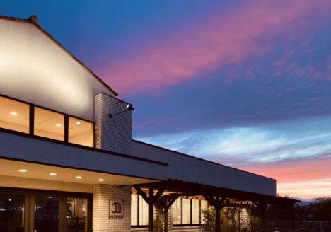
  • Sunset at Sendai

    東北に現れし新人 / Whence came one to Tohoku

    東北で始まった新しい生活と、住宅業界での新しい仕事。デジタルストラテジーやコミュニケーションデザインに向き合いながら、家づくりの言葉を生活者の目線に置き換える日々について書きました。最近読んだ2冊の本と、紙の手帳を使い始めて気づいたデジタルとアナログの面白さも紹介しています。

    A new life in Tohoku, a new industry, and plenty of unfamiliar language to learn. This piece reflects on translating the world of housing into everyday words, two recent books, and an unexpected return to paper and pen in the middle of a very digital working life.

  • お久しぶりです / It’s been too long

    止まっていたブログを再始動。日米を行き来する間に家族ができ、暮らしは育児中心に。仕事はコンサルから東北の自然素材の家づくりへ。いまはデジタル戦略とコミュニケーション担当。これからもブランディング、文化、言葉、未整理の思考を綴っていきます。

    Back again. Between Japan and the US, I started a family and life shifts to childcare. I changed gigs from global consulting to a Tohoku homebuilder, now on digital strategy and communication design. I’ll continue writing about branding, culture, language and whatever comes to mind.

  • Eric Carle

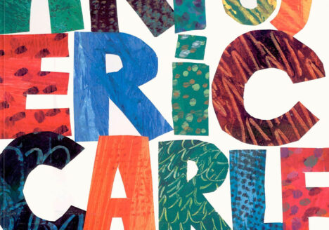
    美しく羽ばたく蝶に進化を。Eric Carleを偲んで

    幼稚園で出会った『はらぺこあおむし』の鮮烈な色とコラージュが創作の原点に。〈簡潔の深さ〉と技法を惜しみなく公開する姿勢に学び、デジタルの今もアナログの魅力と自分のルーツを胸に、企業とオープンブランドを探りたい。

    The Very Hungry Caterpillar, first met in kindergarten, sparked my love of colour and craft. His “simple” depth and open sharing still guide me; even in digital work I return to analog roots—and hope to co-create open-brand projects with companies.

  • 2021年のソーシャルメディア

    2021年のソーシャルメディア、5つのトレンド予測まとめ

    コロナで日常もSNSの役割も変化。今注目すべきは5つ:4C視点のコロナ発信、ノスタルジア、会話重視、メルマガ/ポッドキャスト復活、完璧さより価値のあるLo-Fi。海外事例が示す鍵は「本質的価値」と「人間味」。変化に適応したブランドだけが新しい関係を築ける。

    COVID reshaped daily life—and the role of social media. Five trends matter now: 4C-informed COVID content, nostalgia marketing, conversation-first engagement, the return of newsletters/podcasts, and lo-fi content that favors value over polish. Global examples point to two keys—real value and a human tone. Brands that adapt will forge new relationships.

  • 7 Ways to Transform the About Page

    「会社概要」をコンバージョンに繋げるする7つのコツ

    閲覧の多いBtoBの会社概要は、羅列で終わらせない。数字や沿革だけでなく、存在意義と人間味を。マントラ、困難を越えたストーリー、スタッフ紹介、臨場感ある写真、受賞・資格を示し、最後は明確な行動導線へ。信頼と魅力を高め、問い合わせに直結させる。

    Don’t let high-traffic B2B “About” pages be mere lists. Beyond numbers and history, show purpose and humanity. Use a mantra, resilience stories, team profiles, immersive photos, and highlight awards/certifications—then end with a clear CTA. You’ll build trust, increase appeal, and drive inquiries.

  • Good Photo, Bad Photo

    御社の海外サイトは大丈夫?素材写真の使いすぎにご注意

    海外向けWebサイトで「握手するビジネスマン」「笑顔のオペレーター」は使い回し感で逆効果。欧米はビジュアル感度が高く、第一印象が信頼を左右。理想はプロ撮影。素材でも品質・色補正・デザインでオリジナリティを。翻訳だけでなく写真にも配慮するのが近道。

    On global sites, cliché stock like “handshake businessmen” or “smiling call operators” are cheap and overused. Visual quality shapes trust at first glance. Aim for professional shoots; if using stock, demand quality, color correction, and design-led originality. Don’t just translate—curate your imagery.

  • Tips on Going Multilingual

    多言語サイト構築時に知っておきたい 5つのポイント

    多言語サイトは翻訳だけでは不十分。文字量差でレイアウトが崩れ、言語切替の導線がないと不便です。自動返信メールやURL設計など細部対応、国旗アイコンの配慮も必須。

    Multilingual sites need more than translation. Different text lengths can break layouts, and poor language switching hurts UX. Don’t overlook auto-reply emails, URL structure, or the sensitivities around language switching UI based on flag icons. Get these details right to make your site welcoming for global users.

All posts are shown